‘Quick and dirty’ (utility) plots
When exploring a dataset, often useful to use built in functions or helpers from other libraries. These help you quickly visualise relationships, but aren’t always exactly what you need and can be hard to customise.
5.0.1 Distributions
hist(mtcars$mpg)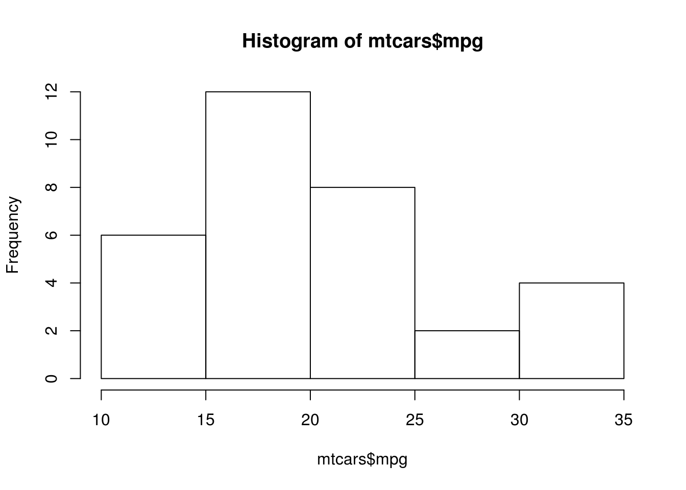
plot(density(mtcars$mpg))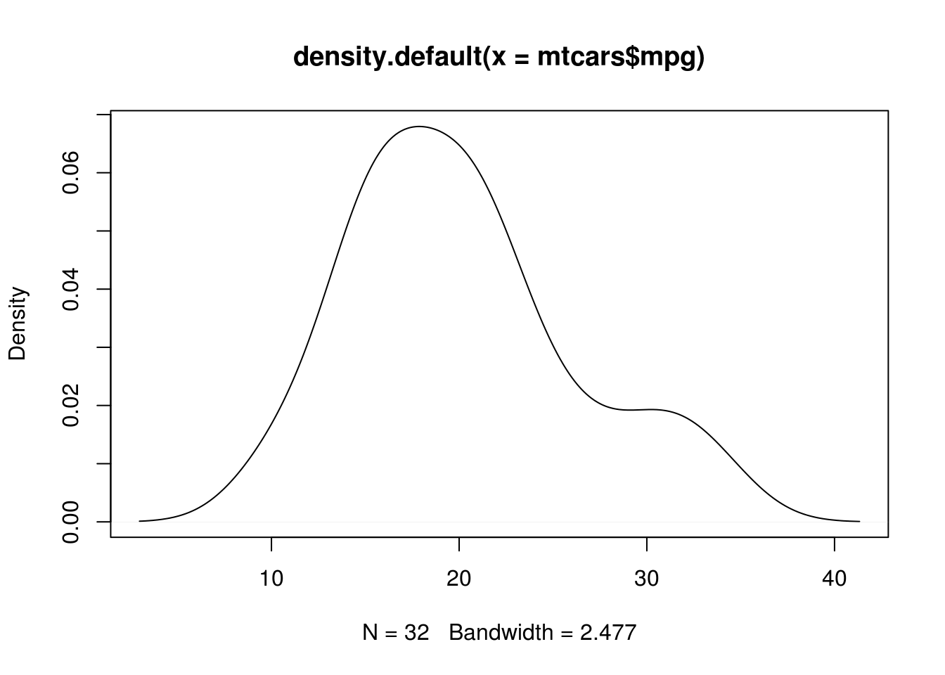
boxplot(mpg~cyl, data=mtcars)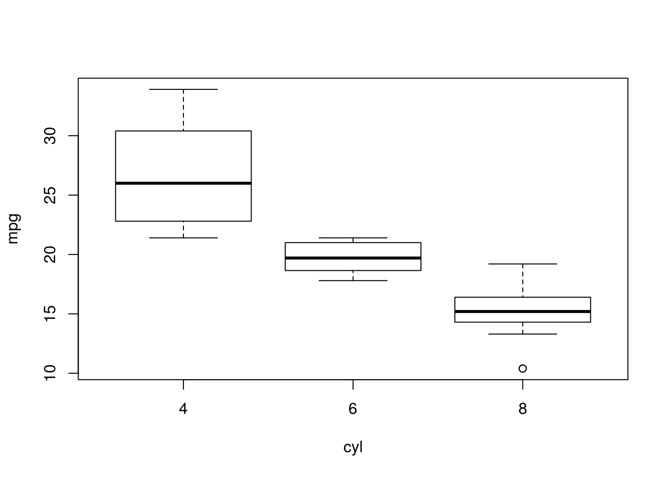
Hmisc::hist.data.frame(mtcars)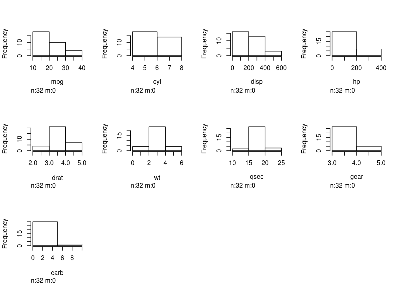
Even for simple plots, ggplot has some useful helper functions though:
qplot(mpg, data=mtcars, geom="density") + xlab("Miles per gallon")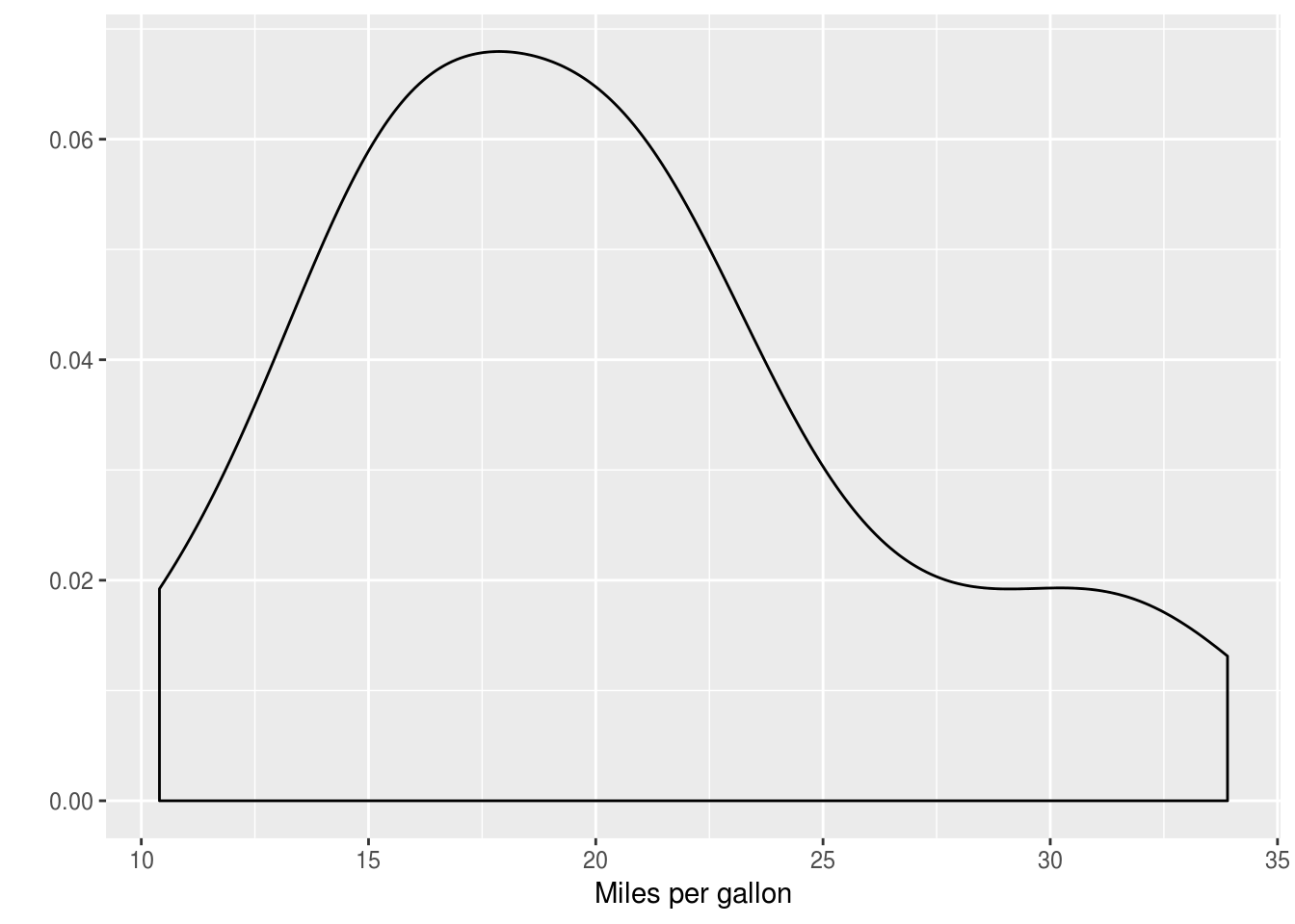
qplot(x=factor(cyl), y=mpg, data=mtcars, geom="boxplot")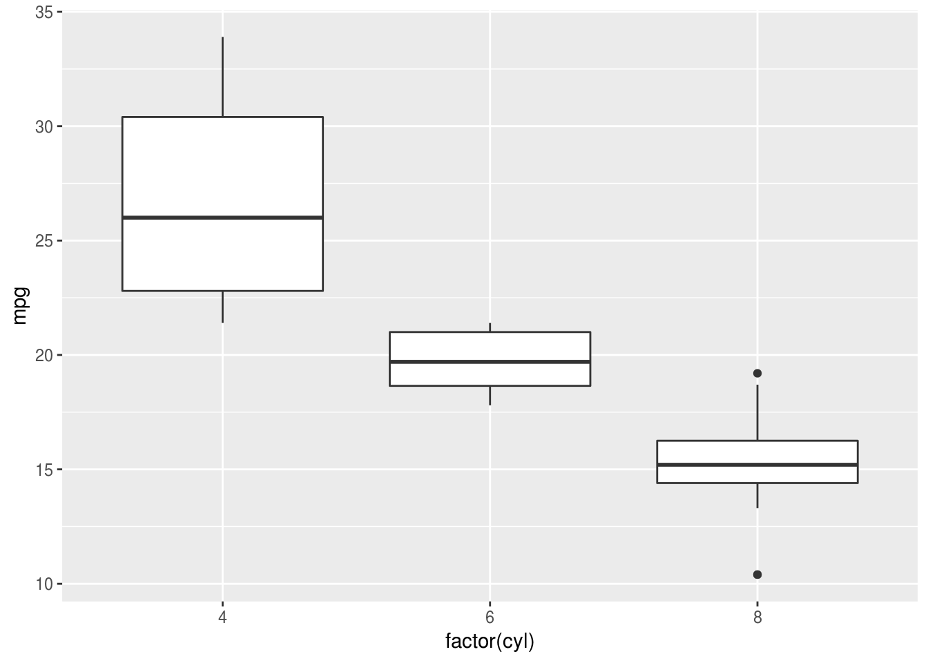
5.0.2 Relationships
with(mtcars, plot(mpg, wt))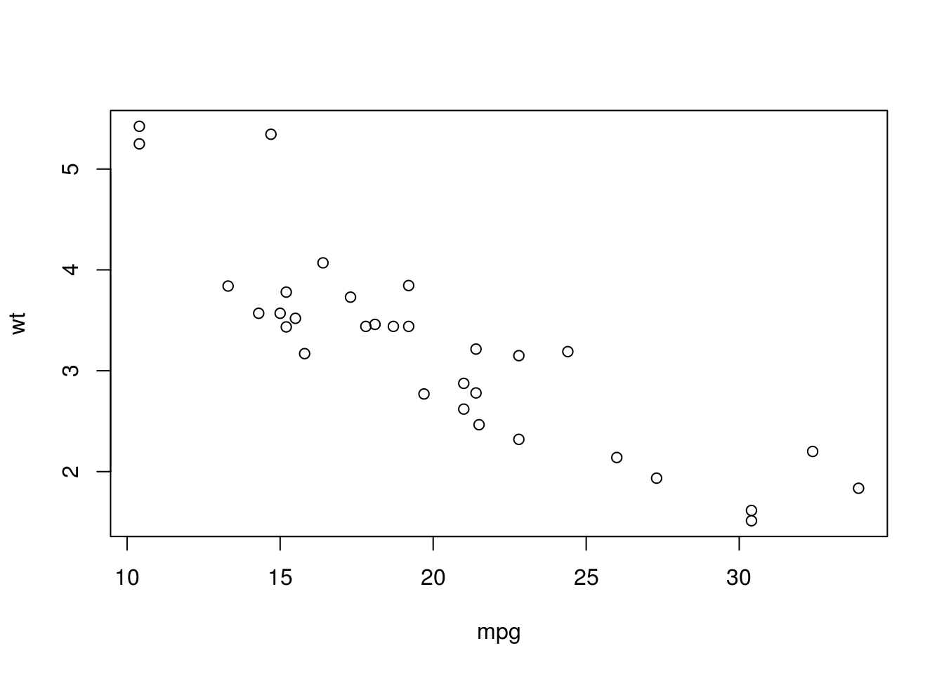
pairs(select(mtcars, wt, disp, mpg))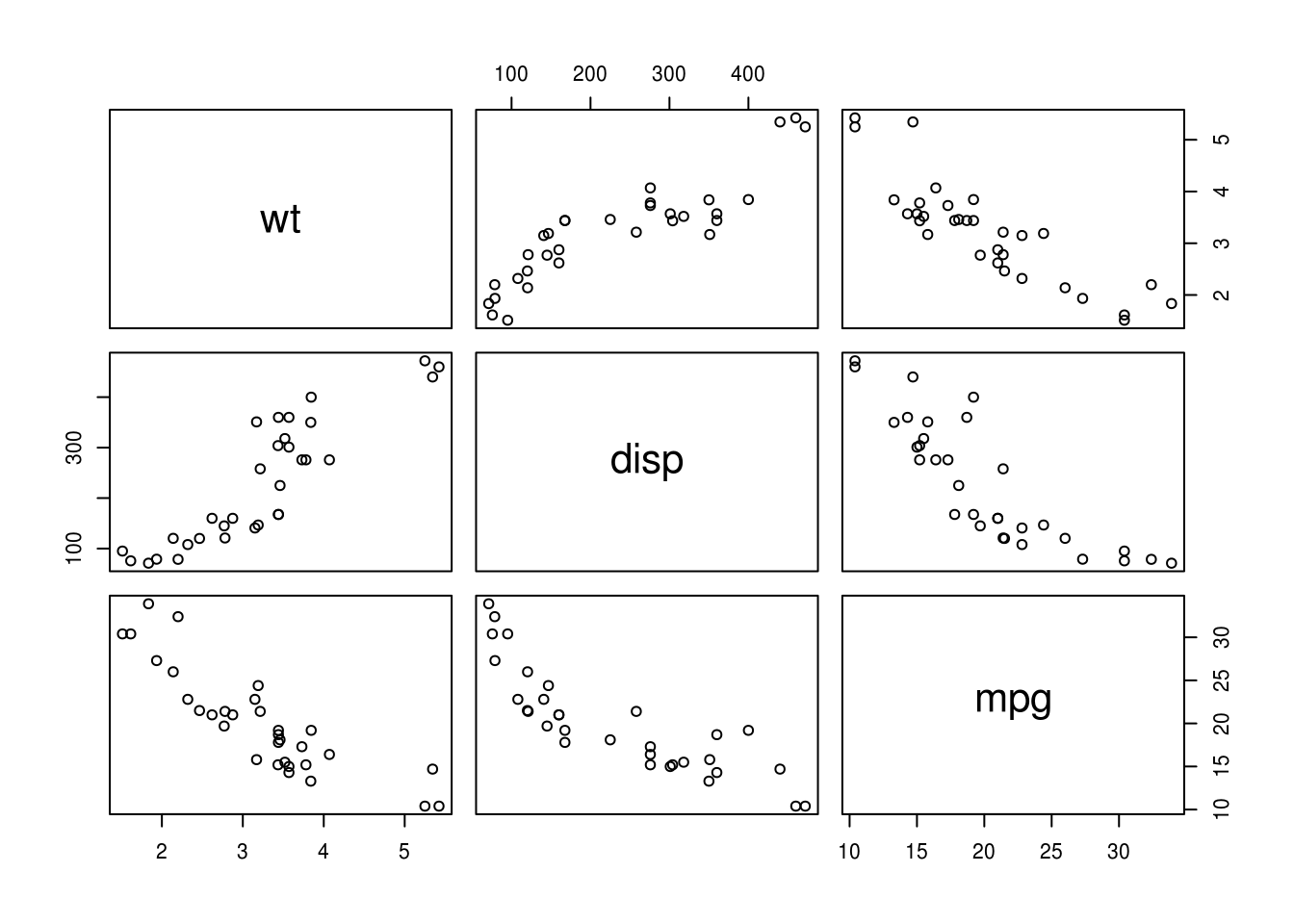
Again, for quick plots ggplot also has useful shortcut functions:
qplot(mpg, wt, color=factor(cyl), data = mtcars)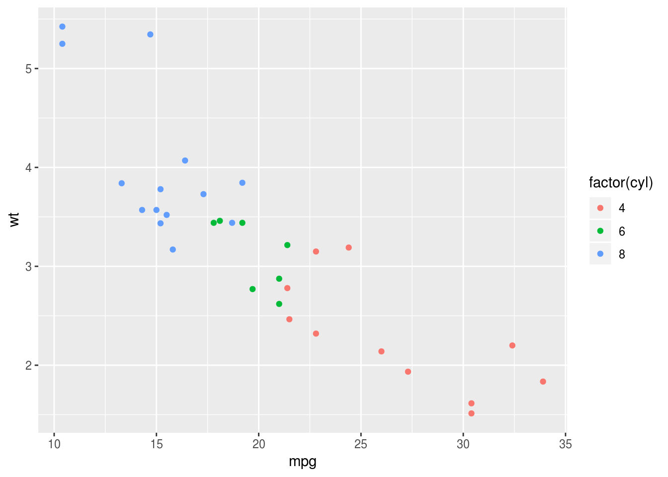
5.0.3 Quantities
I don’t think the base R plots are that convenient here. ggplot2:: and the
stat_summary() function makes life much simpler:
ggplot(mtcars, aes(factor(cyl), mpg)) +
  stat_summary(geom="bar")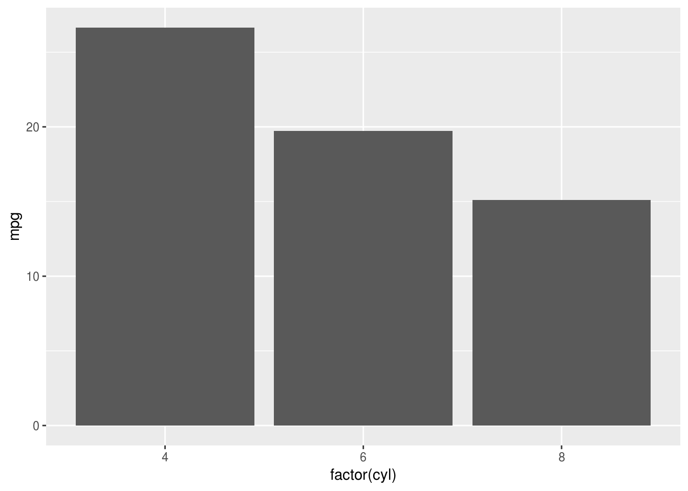
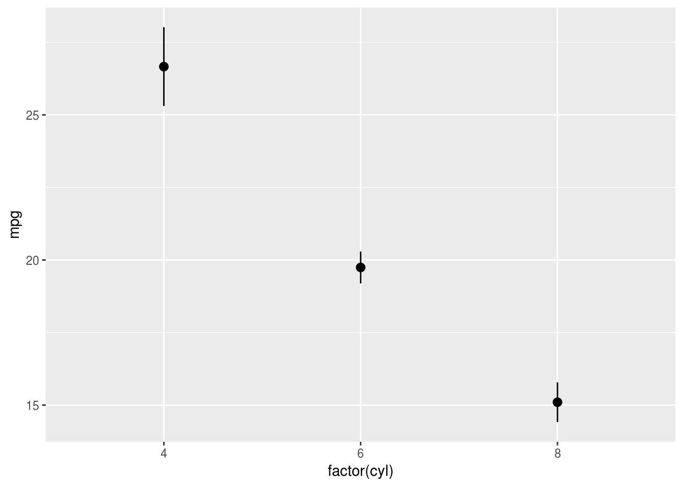
And if you are plotting quantities, as disussed above, showing a range is sensible (a boxplot would also fill both definitions):
ggplot(mtcars, aes(factor(cyl), mpg)) +
  stat_summary(geom="pointrange")