2 The dataframe
A dataframe is a container for our data.
It’s much like a spreadsheet, but with some constraints applied. ‘Constraints’ might sound bad, but they’re actually helpful: they make dataframes more structured and predictable to work with. The main constraints are that:
Each column is a vector, and so can only store one type of data.
Every column has to be the same length (although missing values are allowed).
Each column must have a name.
A tibble is an updated version of a dataframe with a whimsical name, which is
part of the tidyverse. It’s almost exactly the same a dataframe, but with some
rough edges smoothed off — it’s safe and preferred to use tibble in place of
data.frame.
You can make a simple tibble or dataframe like this:
data.frame(myvariable = 1:10)
   myvariable
1           1
2           2
3           3
4           4
5           5
6           6
7           7
8           8
9           9
10         10
Using a tible is much the same, but allows some extra tricks like creating one variable from another:
tibble(
    height_m = rnorm(10, 1.5, .2),
    weight_kg = rnorm(10, 65, 10),
    bmi = weight_kg / height_m ^ 2,
    overweight = bmi > 25
)
# A tibble: 10 x 4
   height_m weight_kg   bmi overweight
      <dbl>     <dbl> <dbl> <lgl>
 1     1.22      64.7  43.7 TRUE
 2     1.70      57.6  20.0 FALSE
 3     1.65      52.5  19.2 FALSE
 4     1.57      67.6  27.5 TRUE
 5     1.29      72.6  43.6 TRUE
 6     1.26      60.5  38.0 TRUE
 7     1.36      72.7  39.5 TRUE
 8     1.70      50.1  17.4 FALSE
 9     1.32      89.8  51.9 TRUE
10     1.27      72.5  44.8 TRUE
Using ‘built in’ data
The quickest way to see a dataframe in action is to use one that is built in to R (this page lists all the built-in datasets). For example:
head(airquality)
  Ozone Solar.R Wind Temp Month Day
1    41     190  7.4   67     5   1
2    36     118  8.0   72     5   2
3    12     149 12.6   74     5   3
4    18     313 11.5   62     5   4
5    NA      NA 14.3   56     5   5
6    28      NA 14.9   66     5   6
Or
head(mtcars)
                   mpg cyl disp  hp drat    wt  qsec vs am gear carb
Mazda RX4         21.0   6  160 110 3.90 2.620 16.46  0  1    4    4
Mazda RX4 Wag     21.0   6  160 110 3.90 2.875 17.02  0  1    4    4
Datsun 710        22.8   4  108  93 3.85 2.320 18.61  1  1    4    1
Hornet 4 Drive    21.4   6  258 110 3.08 3.215 19.44  1  0    3    1
Hornet Sportabout 18.7   8  360 175 3.15 3.440 17.02  0  0    3    2
Valiant           18.1   6  225 105 2.76 3.460 20.22  1  0    3    1
In both these examples the datasets are already loaded and available to be used
with the head() function.
To find a list of all the built in datasets you can type help(datasets) into
the console, or see
https://stat.ethz.ch/R-manual/R-devel/library/datasets/html/00Index.html.
Familiarise yourself with some of the other included datasets, e.g.
datasets::attitude. Watch out that not all the included datasets are
dataframes: Some are just vectors of observations (e.g. the airmiles data)
and some are ‘time-series’, (e.g. the co2 data)
Looking at dataframes
As we’ve already seen, using print(df) within an RMarkdown document creates a
nice interactive table you can use to look at your data.
However you won’t want to print your whole data file when you Knit your
RMarkdown document. The head function can be useful if you just want to show a
few rows:
head(mtcars)
                   mpg cyl disp  hp drat    wt  qsec vs am gear carb
Mazda RX4         21.0   6  160 110 3.90 2.620 16.46  0  1    4    4
Mazda RX4 Wag     21.0   6  160 110 3.90 2.875 17.02  0  1    4    4
Datsun 710        22.8   4  108  93 3.85 2.320 18.61  1  1    4    1
Hornet 4 Drive    21.4   6  258 110 3.08 3.215 19.44  1  0    3    1
Hornet Sportabout 18.7   8  360 175 3.15 3.440 17.02  0  0    3    2
Valiant           18.1   6  225 105 2.76 3.460 20.22  1  0    3    1
Or we can use glimpse() function from the dplyr:: package (see the
section on loading and using packages) for a different view of the
first few rows of the mtcars data. This flips the dataframe so the variables
are listed in the first column of the output:
glimpse(mtcars)
Observations: 32
Variables: 11
$ mpg  <dbl> 21.0, 21.0, 22.8, 21.4, 18.7, 18.1, 14.3, 24.4, 22.8, 19.2,…
$ cyl  <dbl> 6, 6, 4, 6, 8, 6, 8, 4, 4, 6, 6, 8, 8, 8, 8, 8, 8, 4, 4, 4,…
$ disp <dbl> 160.0, 160.0, 108.0, 258.0, 360.0, 225.0, 360.0, 146.7, 140…
$ hp   <dbl> 110, 110, 93, 110, 175, 105, 245, 62, 95, 123, 123, 180, 18…
$ drat <dbl> 3.90, 3.90, 3.85, 3.08, 3.15, 2.76, 3.21, 3.69, 3.92, 3.92,…
$ wt   <dbl> 2.620, 2.875, 2.320, 3.215, 3.440, 3.460, 3.570, 3.190, 3.1…
$ qsec <dbl> 16.46, 17.02, 18.61, 19.44, 17.02, 20.22, 15.84, 20.00, 22.…
$ vs   <dbl> 0, 0, 1, 1, 0, 1, 0, 1, 1, 1, 1, 0, 0, 0, 0, 0, 0, 1, 1, 1,…
$ am   <dbl> 1, 1, 1, 0, 0, 0, 0, 0, 0, 0, 0, 0, 0, 0, 0, 0, 0, 1, 1, 1,…
$ gear <dbl> 4, 4, 4, 3, 3, 3, 3, 4, 4, 4, 4, 3, 3, 3, 3, 3, 3, 4, 4, 4,…
$ carb <dbl> 4, 4, 1, 1, 2, 1, 4, 2, 2, 4, 4, 3, 3, 3, 4, 4, 4, 1, 2, 1,…
You can use the pander() function (from the pander:: package) to format
tables nicely, for when you Knit a document to HTML, Word or PDF. For example:
library(pander)
pander(head(airquality), caption="Tables always need a caption.")| Ozone | Solar.R | Wind | Temp | Month | Day |
|---|---|---|---|---|---|
| 41 | 190 | 7.4 | 67 | 5 | 1 |
| 36 | 118 | 8 | 72 | 5 | 2 |
| 12 | 149 | 12.6 | 74 | 5 | 3 |
| 18 | 313 | 11.5 | 62 | 5 | 4 |
| NA | NA | 14.3 | 56 | 5 | 5 |
| 28 | NA | 14.9 | 66 | 5 | 6 |
See the section on sharing and publishing for more ways to format and present tables.
Other useful functions for looking at and exploring datasets include:
summary(df)psych::describe(df)skimr::skim(df)
Experiment with a few of the functions for viewing/summarising dataframes.
There are also some helpful plotting functions which accept a whole dataframe as their input:
boxplot(airquality)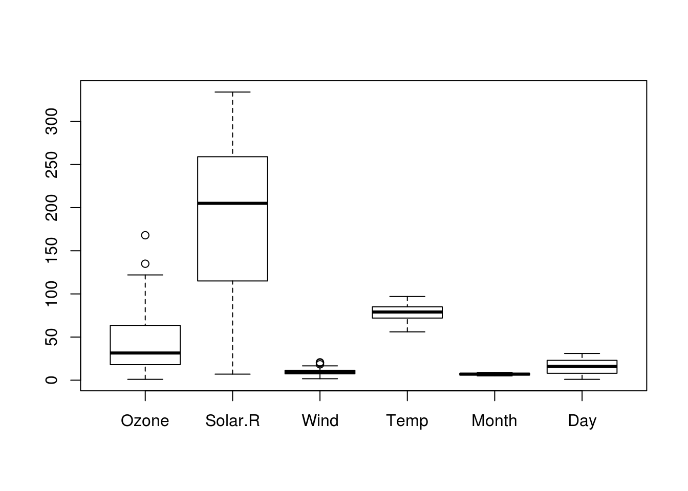
Figure 2.1: Box plot of all variables in a dataset.
psych::cor.plot(airquality)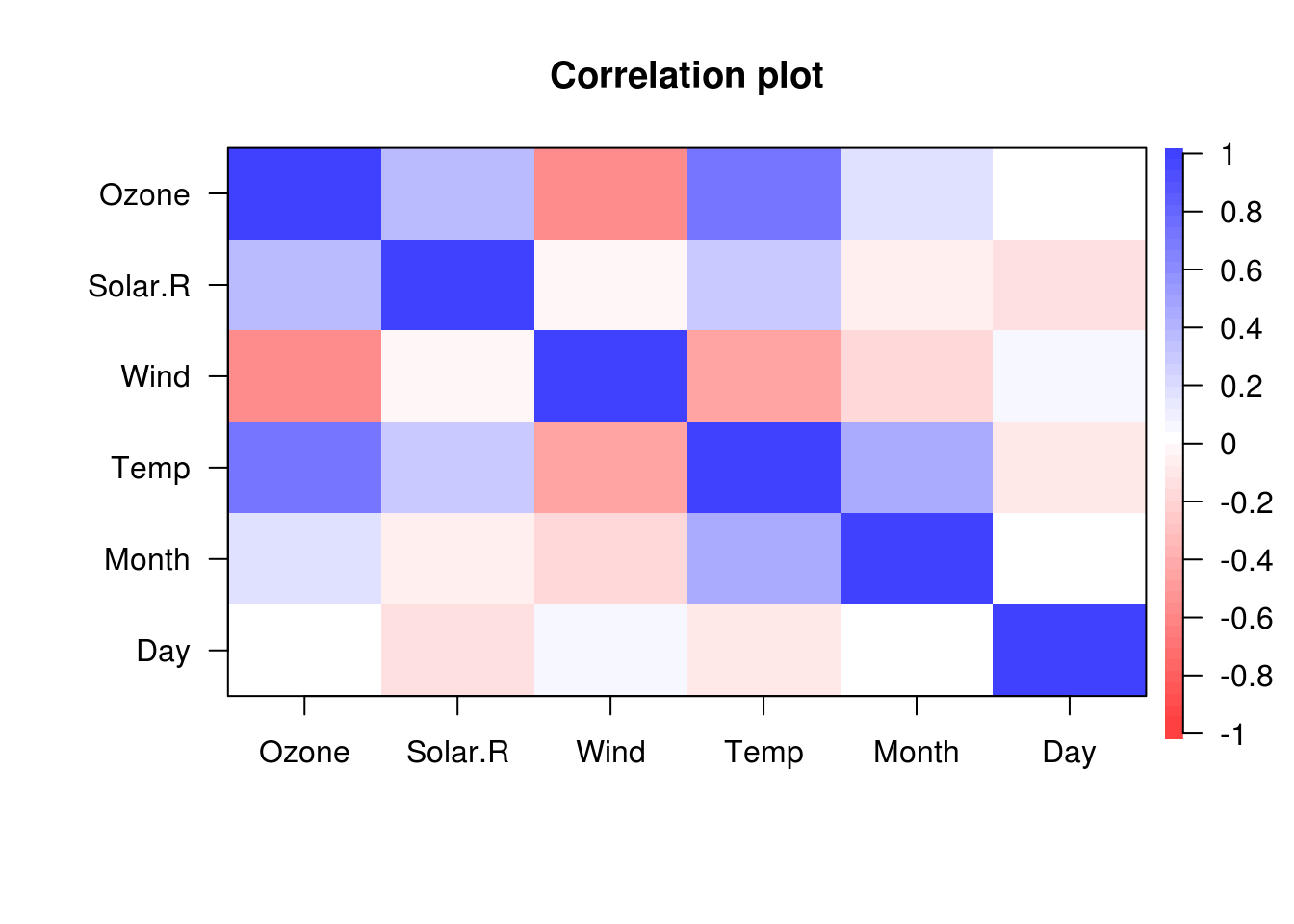
Figure 2.2: Correlation heatmap of all variables in a dataset. Colours indicate size of the correlation between pairs of variables.
These plots might not be worth including in a final write-up, but are very useful when exploring your data.