Predicted means and margins using lm()
The section above details two types of predictions: predictions for means, and predictions for margins (effects). We can use the figure below as a way of visualising the difference:
gridExtra::grid.arrange(means.plot+ggtitle("Means"), margins.plot+ggtitle("Margins"), ncol=2)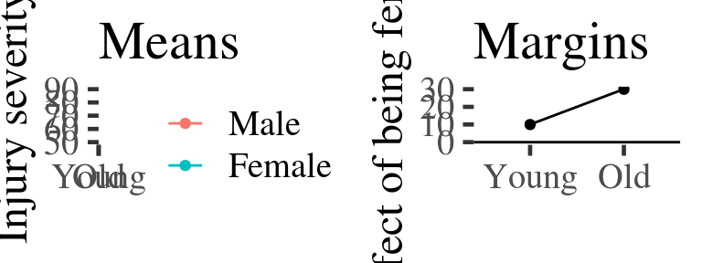
Figure 2.1: Example of predicted means vs. margins. Note, the margin plotted in the second panel is the difference between the coloured lines in the first. A horizontal line is added at zero in panel 2 by convention.
Running the model
Lets say we want to run a linear model predicts injury severity from gender and a categorical measurement of age (young v.s. old).
Our model formula would be: severity.of.injury ~ age.category * gender. Here
we fit it an request the Anova table which enables us to test the main effects
and interaction12:
injurymodel <- lm(severity.of.injury ~ age.category * gender,  data=injuries)
anova(injurymodel)
Analysis of Variance Table

Response: severity.of.injury
                     Df  Sum Sq Mean Sq F value    Pr(>F)
age.category          1  3920.1  3920.1 144.647 < 2.2e-16 ***
gender                1  9380.6  9380.6 346.134 < 2.2e-16 ***
age.category:gender   1  1148.7  1148.7  42.384 1.187e-10 ***
Residuals           996 26992.7    27.1
---
Signif. codes:  0 '***' 0.001 '**' 0.01 '*' 0.05 '.' 0.1 ' ' 1
Having saved the regression model in the variable injurymodel we can use this
to make predictions for means and estimate marginal effects:
Making predictions for means
When making predictions, they key question to bear in mind is ‘predictions for what?’ That is, what values of the predictor variables are we going to use to estimate the outcome?
It goes like this:
- Create a new dataframe which contains the values of the predictors we want to make predictions at
- Make the predictions using the
predict()function. - Convert the output of
predict()to a dataframe and plot the numbers.
Step 1: Make a new dataframe
prediction.data <- data_frame(
  age.category = c("young", "older", "young", "older"),
  gender = c("Male", "Male", "Female", "Female")
)
prediction.data
# A tibble: 4 x 2
  age.category gender
  <chr>        <chr>
1 young        Male
2 older        Male
3 young        Female
4 older        Female
Step 2: Make the predictions
The R predict() function has two useful arguments:
newdata, which we set to our new data frame containing the predictor values of interestintervalwhich we here set to confidence13
injury.predictions <- predict(injurymodel, newdata=prediction.data, interval="confidence")
injury.predictions
       fit      lwr      upr
1 56.91198 56.24128 57.58267
2 58.90426 58.27192 59.53660
3 60.84242 60.20394 61.48090
4 67.12600 66.48119 67.77081
Making prdictions for margins (effects of predictors)
library('tidyverse')
m <- lm(mpg~vs+wt, data=mtcars)
m.predictions <- predict(m, interval='confidence')

mtcars.plus.predictions <- bind_cols(
  mtcars,
  m.predictions %>% as_data_frame()
)

prediction.frame <- expand.grid(vs=0:1, wt=2) %>%
  as_data_frame()

prediction.frame.plus.predictions <- bind_cols(
  prediction.frame,
  predict(m, newdata=prediction.frame, interval='confidence') %>% as_data_frame()
)


mtcars.plus.predictions %>%
  ggplot(aes(vs, fit, ymin=lwr, ymax=upr)) +
  stat_summary(geom="pointrange")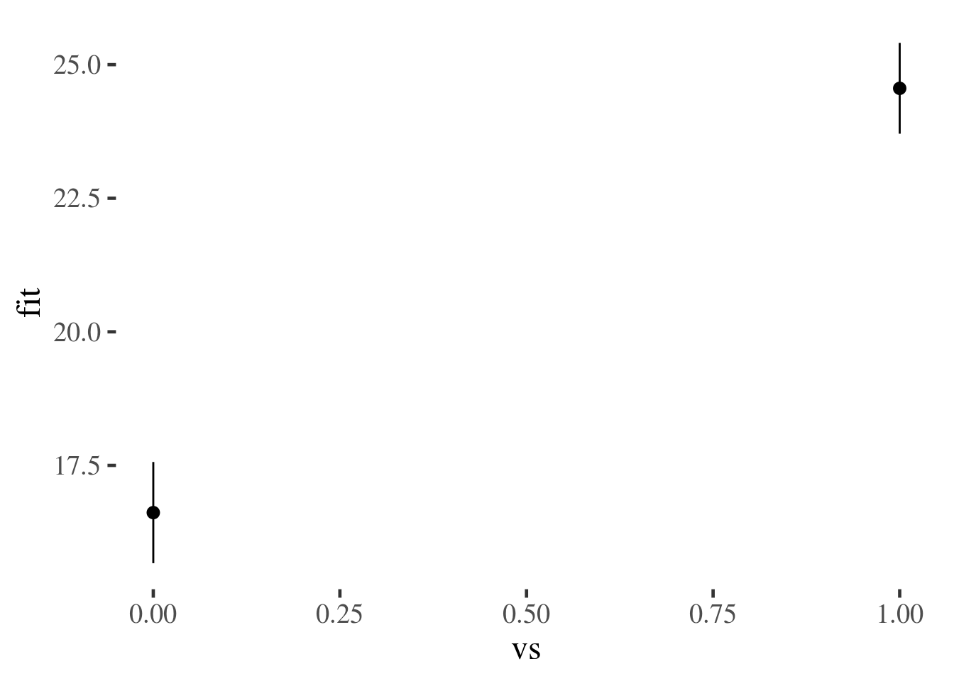
prediction.frame.plus.predictions %>% ggplot(aes(vs, fit, ymin=lwr, ymax=upr)) + geom_pointrange()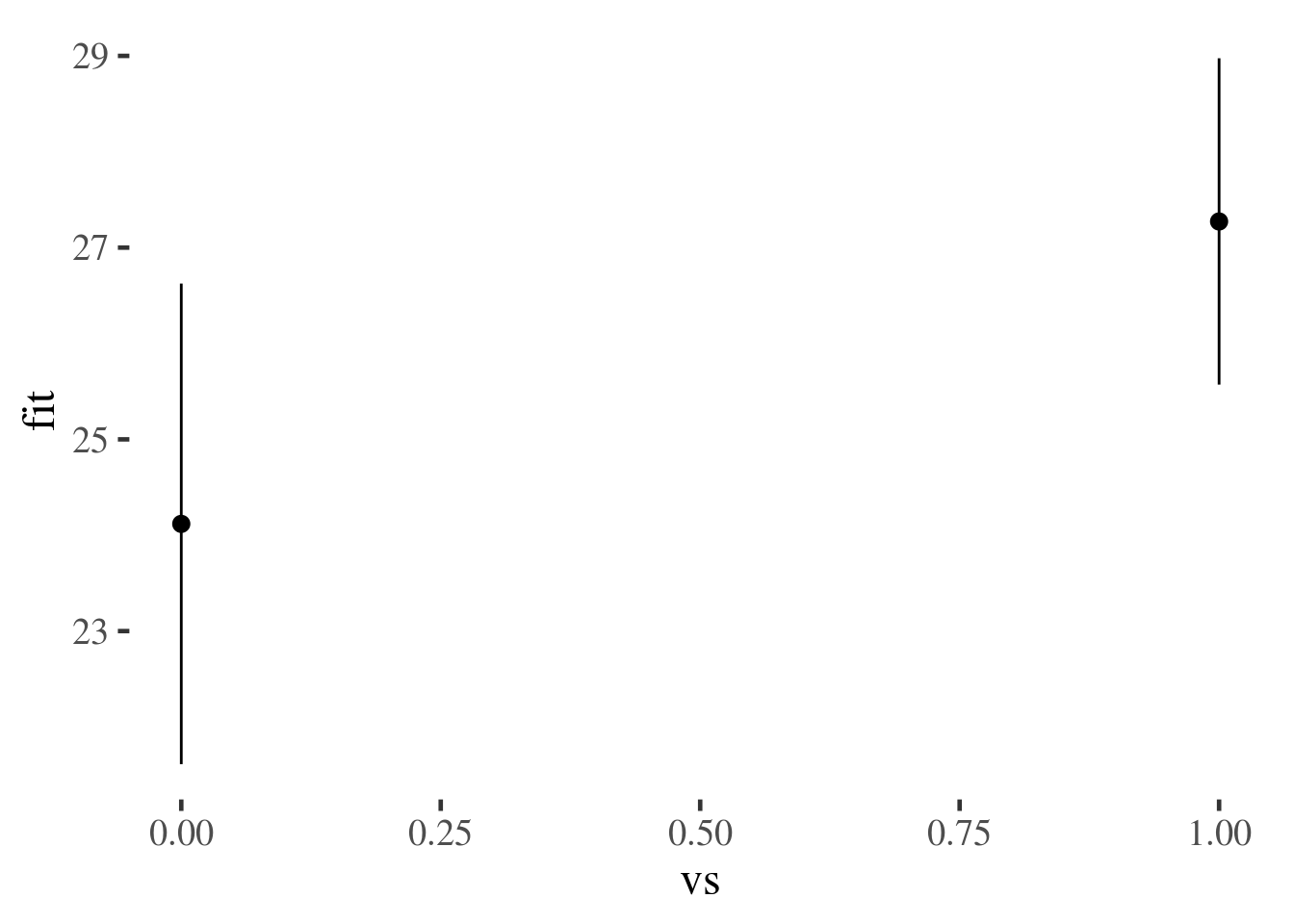
prediction.frame.plus.predictions
# A tibble: 2 x 5
     vs    wt   fit   lwr   upr
  <int> <dbl> <dbl> <dbl> <dbl>
1     0     2  24.1  21.6  26.6
2     1     2  27.3  25.6  29.0
mtcars.plus.predictions %>% group_by(vs) %>%
  summarise_each(funs(mean), fit, lwr, upr)
# A tibble: 2 x 4
     vs   fit   lwr   upr
  <dbl> <dbl> <dbl> <dbl>
1     0  16.6  14.9  18.3
2     1  24.6  22.8  26.3
Marginal effects
What is the effect of being black or female on the chance of you getting diabetes?
Two ways of computing, depending on which of these two you hate least:
Calculate the effect of being black for someone who is 50% female (marginal effect at the means, MEM)
Calculate the effect first pretending someone is black, then pretending they are white, and taking the difference between these estimate (average marginal effect, AME)
library(margins)
margins(m, at = list(wt = 1:2))
 at(wt)    vs     wt
      1 3.154 -4.443
      2 3.154 -4.443

m2 <- lm(mpg~vs*wt, data=mtcars)
summary(m2)

Call:
lm(formula = mpg ~ vs * wt, data = mtcars)

Residuals:
    Min      1Q  Median      3Q     Max
-3.9950 -1.7881 -0.3423  1.2935  5.2061

Coefficients:
            Estimate Std. Error t value Pr(>|t|)
(Intercept)  29.5314     2.6221  11.263 6.55e-12 ***
vs           11.7667     3.7638   3.126   0.0041 **
wt           -3.5013     0.6915  -5.063 2.33e-05 ***
vs:wt        -2.9097     1.2157  -2.393   0.0236 *
---
Signif. codes:  0 '***' 0.001 '**' 0.01 '*' 0.05 '.' 0.1 ' ' 1

Residual standard error: 2.578 on 28 degrees of freedom
Multiple R-squared:  0.8348,    Adjusted R-squared:  0.8171
F-statistic: 47.16 on 3 and 28 DF,  p-value: 4.497e-11
m2.margins <- margins(m2, at = list(wt = 1.5:4.5))

summary(m2.margins)
 factor     wt     AME     SE       z      p   lower   upper
     vs 1.5000  7.4021 2.0902  3.5414 0.0004  3.3055 11.4988
     vs 2.5000  4.4924 1.2376  3.6300 0.0003  2.0668  6.9180
     vs 3.5000  1.5827 1.2846  1.2320 0.2179 -0.9351  4.1006
     vs 4.5000 -1.3270 2.1736 -0.6105 0.5415 -5.5872  2.9333
     wt 1.5000 -4.7743 0.5854 -8.1561 0.0000 -5.9216 -3.6270
     wt 2.5000 -4.7743 0.5854 -8.1557 0.0000 -5.9217 -3.6270
     wt 3.5000 -4.7743 0.5854 -8.1561 0.0000 -5.9216 -3.6270
     wt 4.5000 -4.7743 0.5854 -8.1561 0.0000 -5.9216 -3.6270

summary(m2.margins) %>% as_data_frame() %>%
  filter(factor=="vs") %>%
  ggplot(aes(wt, AME)) +
  geom_point() + geom_line()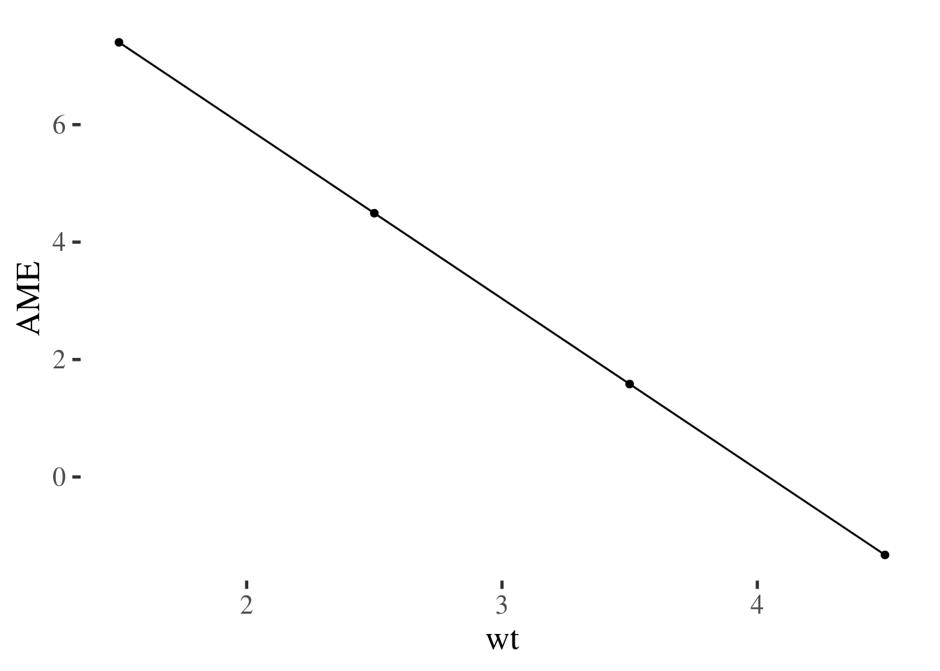
Because this is simulated data, the main effects and interactions all have tiny p values.↩
This gives us the confidence interval for the prediction, which is the range within which we would expect the true value to fall, 95% of the time, if we replicated the study. We could ask instead for the
predictioninterval, which would be the range within which 95% of new observations with the same predictor values would fall. For more on this see the section on confidence v.s. prediction intervals↩