15 Unpicking interactions
Objectives of this section:
- Clarify/recap what an interaction is
- Appreciate the importance of visualising interactions
Compare different methods of plotting interactions in raw data
- Visualise interactions based on statistical model predictions
- Deal with cases where predictors are both categorical and continuous (or a
What is an interaction?
For an interaction to occur we must measure:
- An outcome: severity of injury in a car crash, for example.
- At least 2 predictors of that outcome: e.g. age and gender.
Let’s think of a scenario where we’ve measured severity of injury after road accidents, along with the age and gender of the drivers involved. Let’s assume10:
- Women are likely to be more seriously injured than men in a crash (a +10 point increase in severity)
- Drivers over 60 are more likely to injured than younger drivers (+10 point severity vs <60 years)
For an interaction to occur we have to show that, for example:
- If you ware old and also female then you will be more severely injured
- This increase in severity of injury is more than we would expect simply by adding the effects for being female (+10 points) and for being over 60 (+10 points). That is, if an interaction occurs the risk of being older and female is > a 20 point increase in severity.
Think of some other example of interactions from your own work.
Interactions capture the idea that the effect of one predictor changes depending on the value of another predictor.
Visualising interactions from raw data
In the previous section we established that interactions capture the idea that the effect of one predictor changes depending on the value of another predictor.
We can see this illustrated in the traditional bar plot below. In the left panel we see a dummy dataset in which there is no interaction; in the right panel are data which do show evidence of an interaction:
Warning: `as_data_frame()` is deprecated, use `as_tibble()` (but mind the new semantics).
This warning is displayed once per session.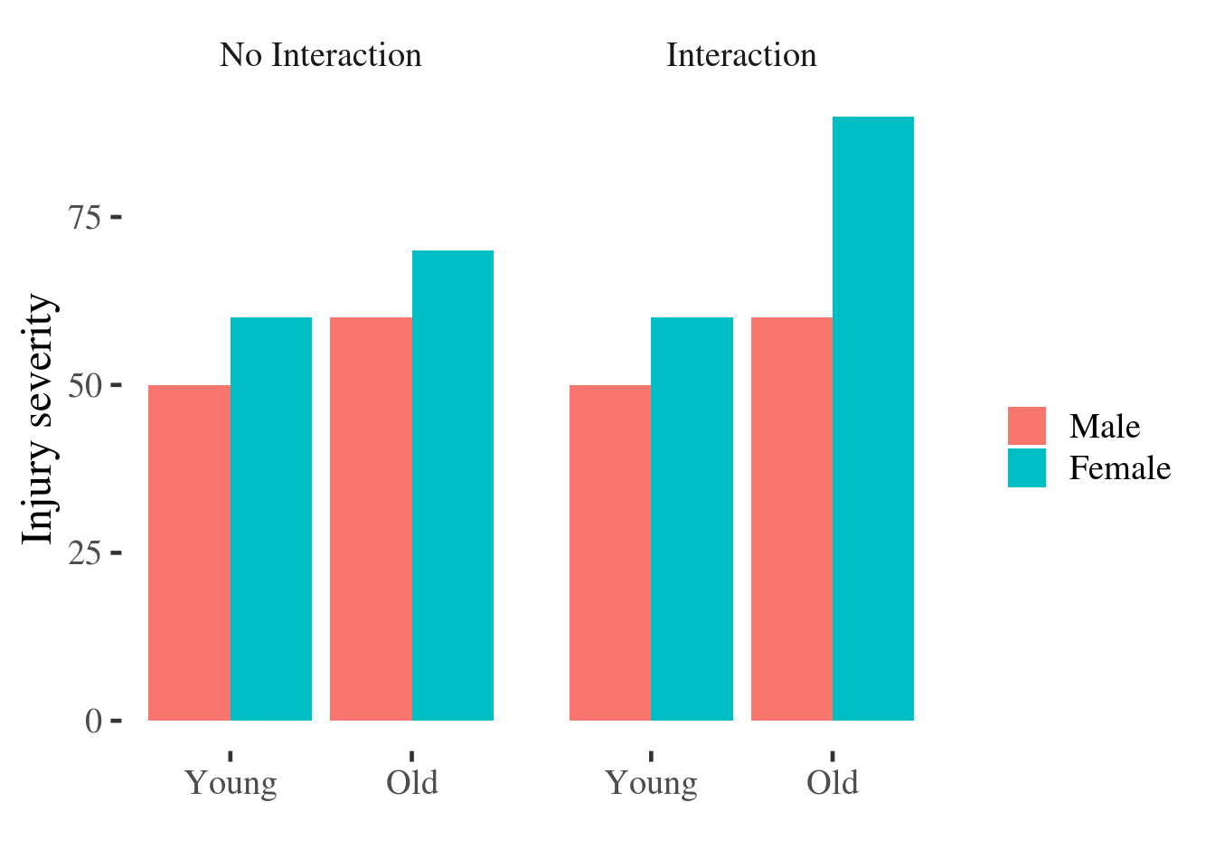
Figure 5.1: Bar plot of injury severity by age and gender.
However this bar plot might be better if it were re-drawn as a point and line plot:
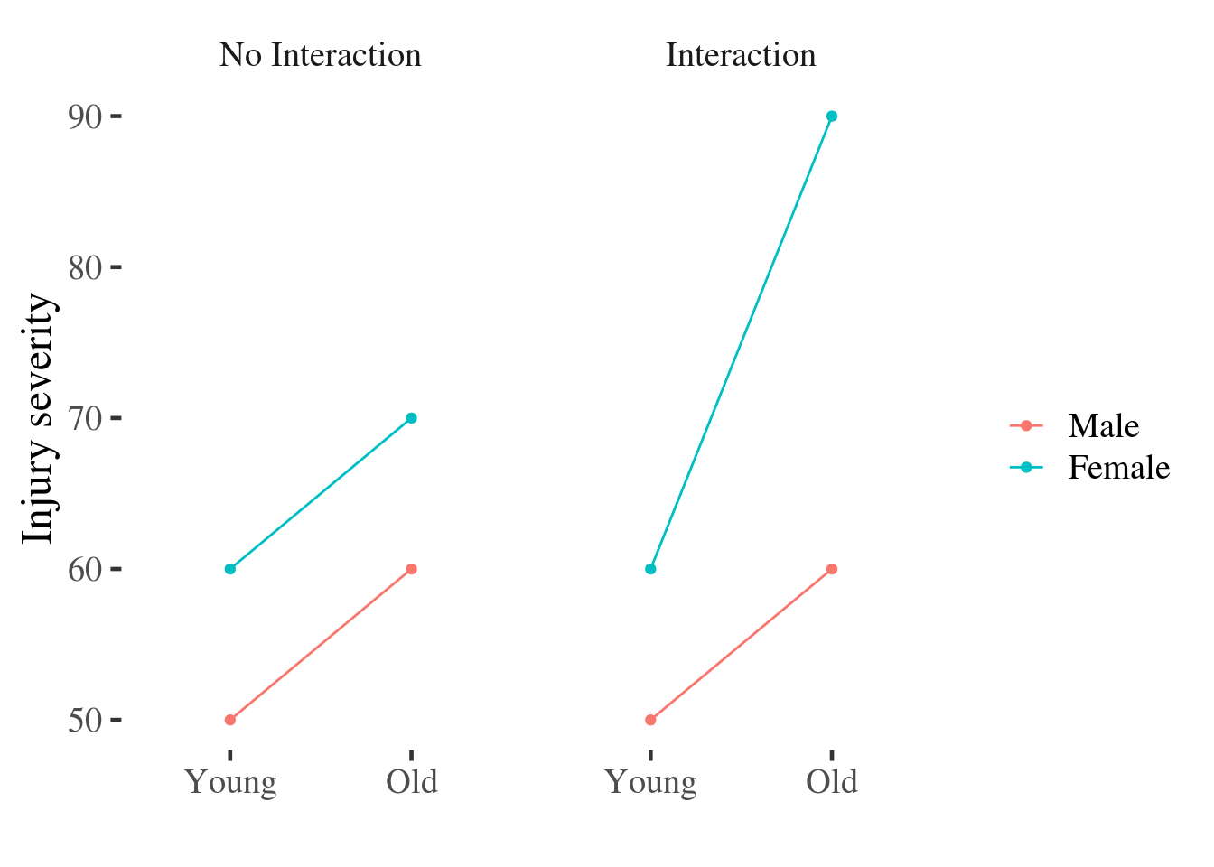
Figure 15.1: Point and line plot of injury severity by age and gender.
The reason the point and line plot improves on the bars for a number of reasons:
Readers tend to misinterpret bar plots by assuming that values ‘above’ the bar are less likely than values contained ‘within’ the bar, when this is not the case [@newman2012bar].
The main effects are easy to distinguish in the line plot: just ask yourself if the lines are horizontal or not, and whether they are separated vertically. In contrast, reading the interaction from the bar graph requires that we average pairs of bars (sometimes not adjacent to one another) and compare them - a much more difficult mental operation.
The interaction is easy to spot: Ask yourself if the lines are parallel. If they are parallel then the difference between men and women is constant for individuals of different ages.
A painful example
Before setting out to test for an interaction using some kind of statistical model, it’s always a good idea to first visualise the relationships between outcomes and predictors.
A student dissertation project investigated the analgesic quality of music
during an experimental pain stimulus. Music was selected to be either liked
(or disliked) by participants and was either familiar or unfamiliar to them.
Pain was rated without music (no.music) and with music (with.music) using a
10cm visual analog scale anchored with the labels “no pain” and “worst pain
ever”.
painmusic <- readRDS('data/painmusic.RDS')
painmusic %>% glimpse
Observations: 112
Variables: 4
$ liked      <fct> Disliked, Disliked, Liked, Disliked, Liked, Liked, Li…
$ familiar   <fct> Familiar, Unfamiliar, Familiar, Familiar, Familiar, F…
$ no.music   <dbl> 4, 4, 6, 5, 3, 2, 6, 6, 7, 2, 7, 3, 5, 7, 6, 3, 7, 7,…
$ with.music <dbl> 7, 8, 7, 3, 3, 1, 6, 8, 9, 8, 7, 5, 7, 8, 4, 5, 4, 8,…
Before running inferential tests, it would be helpful to see if the data are congruent with the study prediction that liked and familiar music would be more effective at reducing pain than disliked or unfamiliar music
We can do this in many different ways. The most common (but not the best) choice
would be a simple bar plot, which we can create using the stat_summary()
function from ggplot2.
painmusic %>%
  mutate(change.in.pain = with.music - no.music) %>%
  ggplot(aes(x = familiar, y=change.in.pain)) +
  facet_wrap(~liked) +
  stat_summary(geom="bar") + xlab("")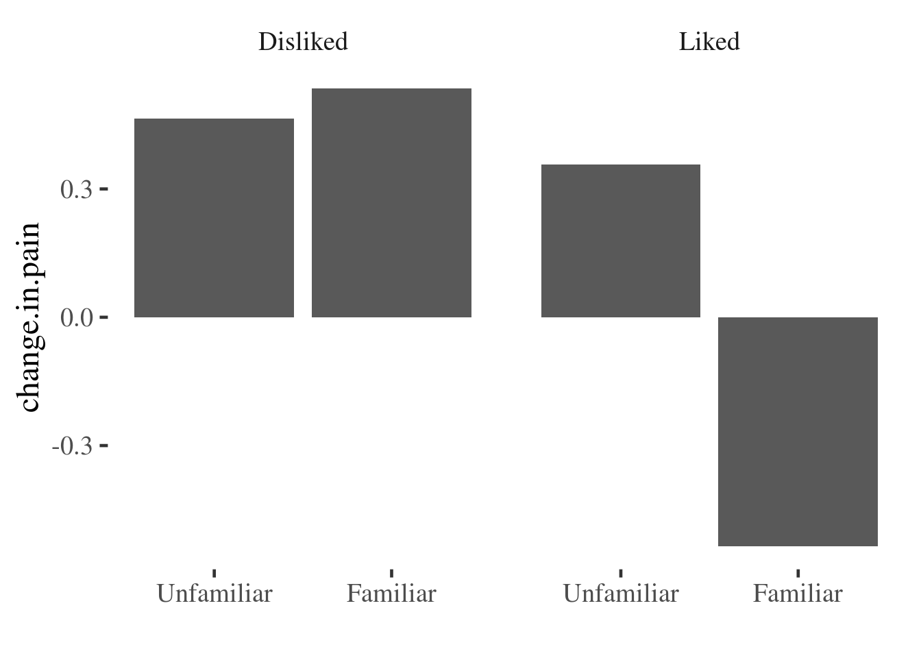
This gives a pretty clear indication that something is going on, but we have no idea about the distribution of the underlying data, and so how much confidence we should place in the finding. We are also hiding distributional information that could be useful to check that assumptions of models we run later are also met (for example of equal variances between groups).
If we want to preserve more information about the underlying distribution we can use density plots, boxplots, or pointrange plots, among others.
Here we use a grouped density plot. The interaction() function is used to
automatically create a variable with the 4 possible groupings we can make when
combining theliked and familiar variables:
painmusic %>%
  mutate(change.in.pain = with.music - no.music) %>%
  ggplot(aes(x = change.in.pain,
             color = interaction(familiar:liked))) +
  geom_density() +
  scale_color_discrete(name="")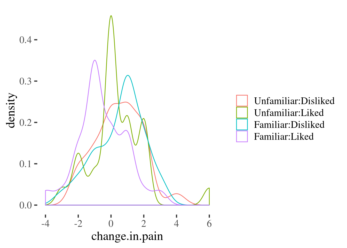
And here we use a boxplot to achieve similar ends:
painmusic %>%
  mutate(change.in.pain = with.music - no.music) %>%
  ggplot(aes(x = interaction(familiar:liked),  y = change.in.pain)) +
  geom_boxplot() +
  geom_hline(yintercept = 0, linetype="dotted") +
  xlab("")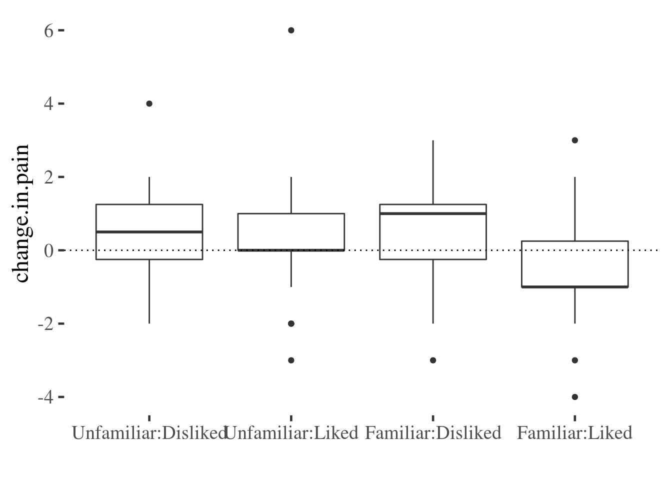
The advantage of these last two plots is that they preserve quite a bit of infrmation about the variable of interest. However, they don’t make it easy to read the main effects and interaction as we saw for the point-line plot above.
We can combine some benefits of both plots by adding an error bar to the point-line plot:
painmusic %>%
  ggplot(aes(liked, with.music - no.music,
             group=familiar, color=familiar)) +
  stat_summary(geom="pointrange", fun.data=mean_se) +
  stat_summary(geom="line",  fun.data=mean_se) +
  ylab("Pain (VAS) with.music - no.music") +
  scale_color_discrete(name="") +
  xlab("")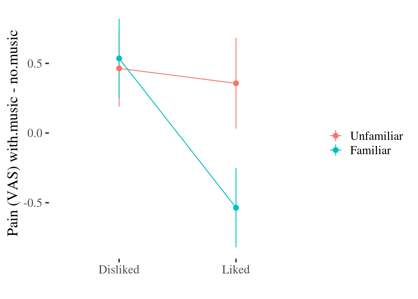
This plot doesn’t include all of the information about the distribution of effects that the density or boxplots do (for example, we can’t see any asymmetry in the distributions any more), but we still get some information about the variability of the effect of the experimental conditions on pain by plotting the SE of the mean over the top of each point11
At this point, especially if your current data include only categorical predictors, you might want to move on to the section on making predictions from models and visualising these.
Continuous predictors
The modelr package contains useful functions which enable you to make
predictions from models, and visualise them easily.
In this example we run two models, with and without a polynomial effect for
hp. The predictions from both models are then plotted against one another.
library(modelr)
m1 <- lm(mpg~hp, data = mtcars)
m2 <- lm(mpg ~ poly(hp, 2), data = mtcars)

mtcars %>% gather_predictions(m1, m2) %>%
  ggplot(aes(hp, pred, color=model)) +
  geom_point() +
  geom_smooth()
`geom_smooth()` using method = 'loess' and formula 'y ~ x'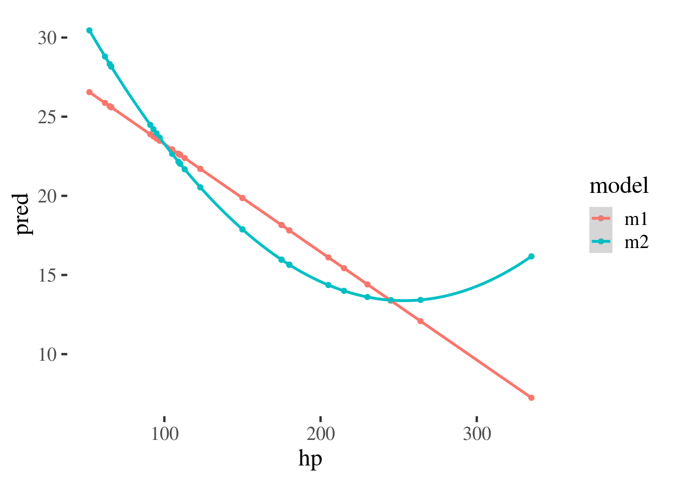
We could also plot this over the top of the original data to give an example of how the models fit the data.
mtcars %>% gather_predictions(m1, m2) %>%
  ggplot(aes(hp, pred, color=model)) +
  geom_smooth()  +
  geom_point(aes(y=mpg), color="grey")
`geom_smooth()` using method = 'loess' and formula 'y ~ x'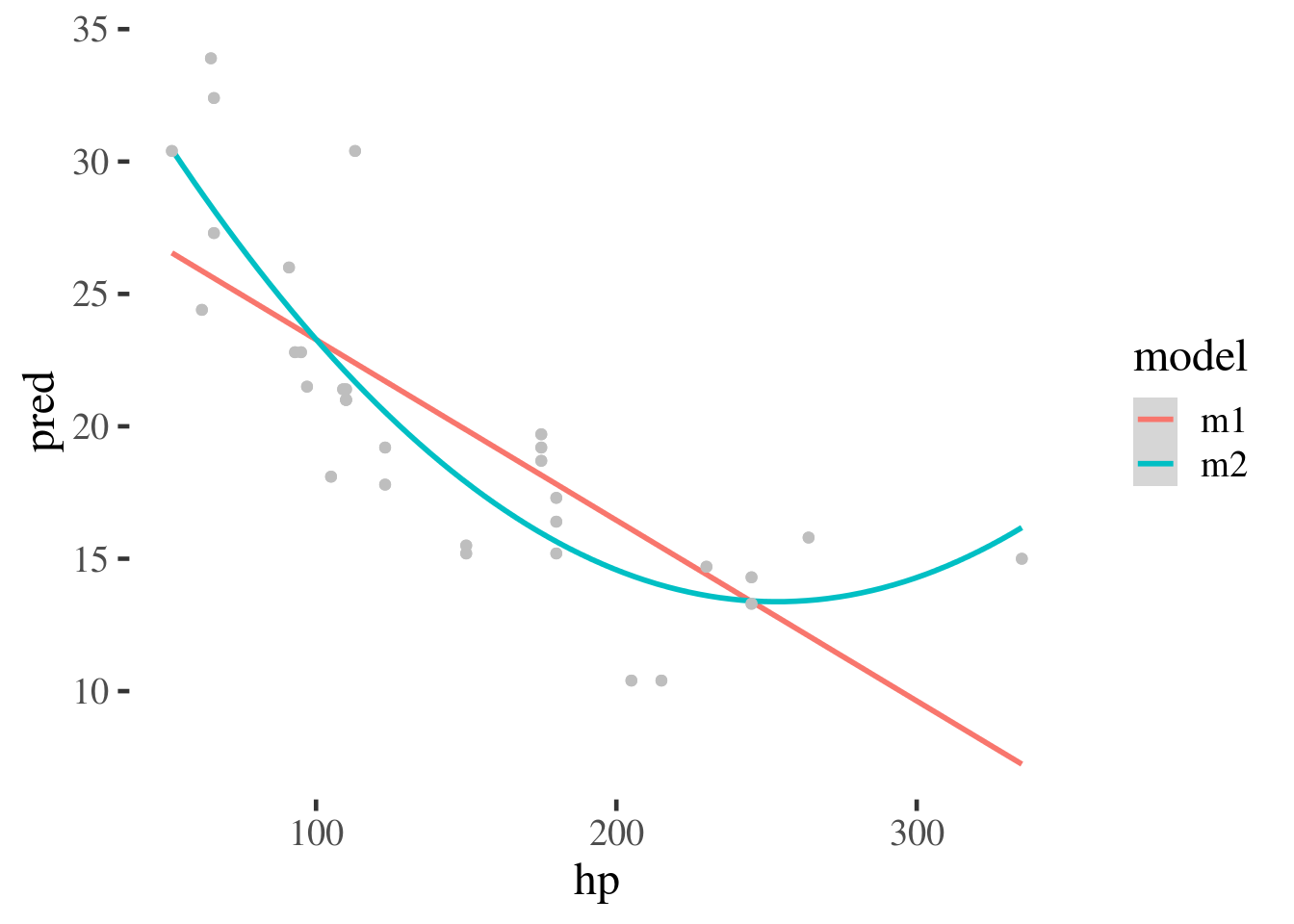
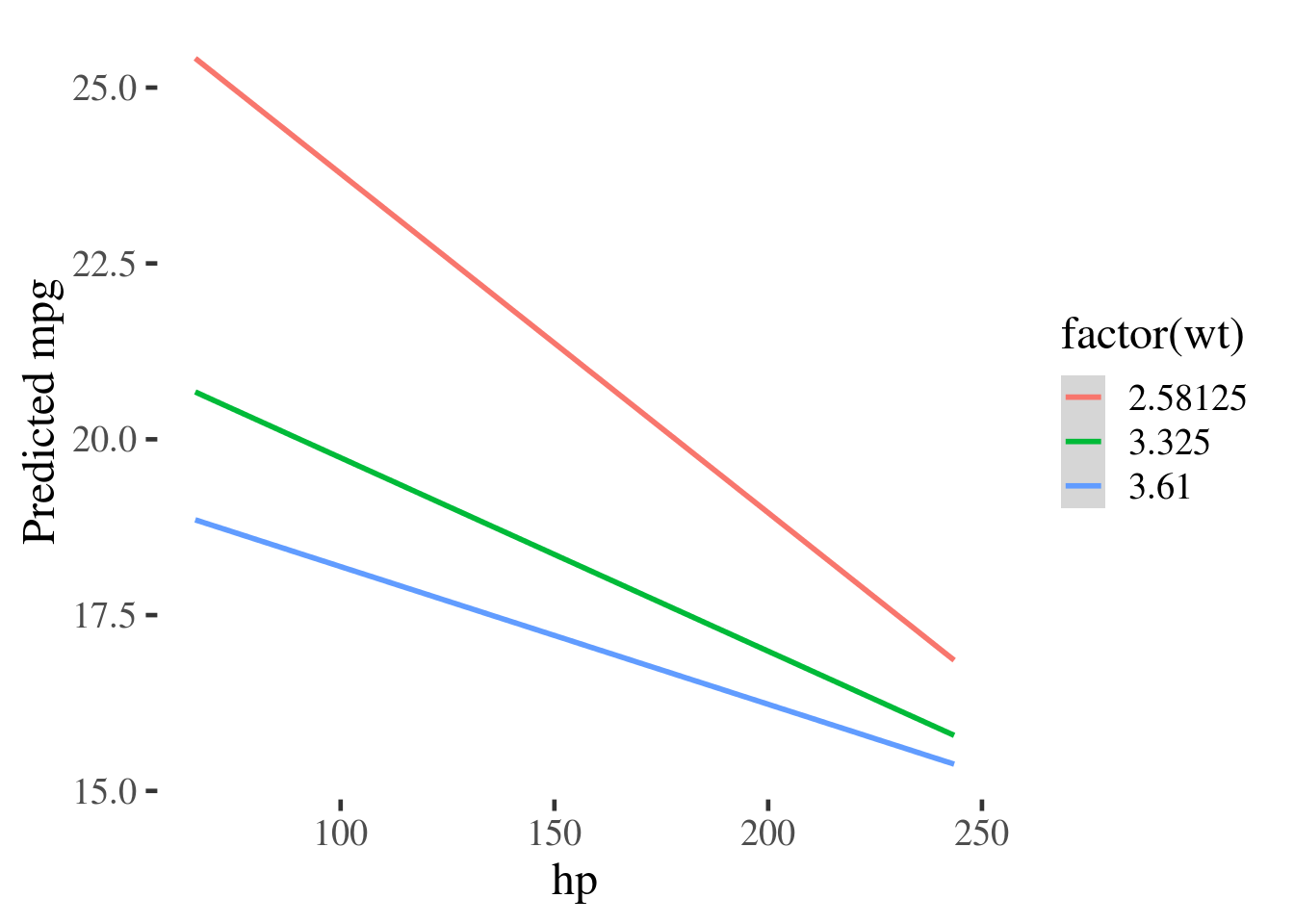
The gather_predictions function can also be used to plot interactions.
m3 <- lm(mpg~wt*hp, data=mtcars)
summary(m3)

Call:
lm(formula = mpg ~ wt * hp, data = mtcars)

Residuals:
    Min      1Q  Median      3Q     Max
-3.0632 -1.6491 -0.7362  1.4211  4.5513

Coefficients:
            Estimate Std. Error t value Pr(>|t|)
(Intercept) 49.80842    3.60516  13.816 5.01e-14 ***
wt          -8.21662    1.26971  -6.471 5.20e-07 ***
hp          -0.12010    0.02470  -4.863 4.04e-05 ***
wt:hp        0.02785    0.00742   3.753 0.000811 ***
---
Signif. codes:  0 '***' 0.001 '**' 0.01 '*' 0.05 '.' 0.1 ' ' 1

Residual standard error: 2.153 on 28 degrees of freedom
Multiple R-squared:  0.8848,    Adjusted R-squared:  0.8724
F-statistic: 71.66 on 3 and 28 DF,  p-value: 2.981e-13
By making a new grid of data, using expand.grid(), at values of interest to
us, we can plot the interaction and see that the effect of wt is diminished as
hp increases.
grid <- expand.grid(wt = quantile(mtcars$wt, probs=c(.25,.5,.75)),
                    hp = quantile(mtcars$hp, probs=c(.1, .25,.5,.75, .9)))

grid %>%
  gather_predictions(m3) %>%
  ggplot(aes(hp, pred, color=factor(wt))) +
  geom_smooth(method="lm") +
  ylab("Predicted mpg")