16 Making predictions
Objectives of this section:
- Distingish predicted means (predictions) from predicted effects (‘margins’)
- Calculate both predictions and marginal effects for a
lm() - Plot predictions and margins
- Think about how to plot effects in meaningful ways
Predictions vs margins
Before we start, let’s consider what we’re trying to achieve in making predictions from our models. We need to make a distinction between:
- Predicted means
- Predicted effects or marginal effects
Consider the example used in a previous section where we measured
injury.severity after road accidents, plus two predictor variables: gender
and age.
Predicted means
‘Predicted means’ (or predictions) refers to our best estimate for each category
of person we’re interested in. For example, if age were categorical (
i.e. young vs. older people) then might have 4 predictions to calculate from our
model:
| Age | Gender | mean |
|---|---|---|
| Young | Male | ? |
| Old | Male | ? |
| Young | Female | ? |
| Old | Female | ? |
And as before, we might plot these data:
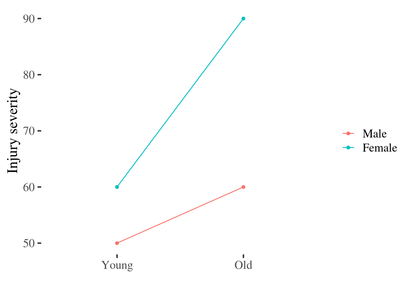
Figure 5.1: Point and line plot of injury severity by age and gender.
This plot uses the raw data, but these points could equally have been estimated from a statistical model which adjusted for other predictors.
Effects (margins)
Terms like: predicted effects, margins or marginal effects refer, instead, to the effect of one predictor.
There may be more than one marginal effect because the effect of one predictor can change across the range of another predictor.
Extending the example above, if we take the difference between men and women for each category of age, we can plot these differences. The steps we need to go through are:
- Reshape the data to be wide, including a separate column for injury scores for men and women
- Subtract the score for men from that of women, to calculate the effect of being female
- Plot this difference score
margins.plot <- inter.df %>%
  # reshape the data to a wider format
  reshape2::dcast(older~female) %>%
  # calculate the difference between men and women for each age
  mutate(effect.of.female = Female - Male) %>%
  # plot the difference
  ggplot(aes(older, effect.of.female, group=1)) +
    geom_point() +
    geom_line() +
    ylab("Effect of being female")  + xlab("") +
    geom_hline(yintercept = 0)
margins.plot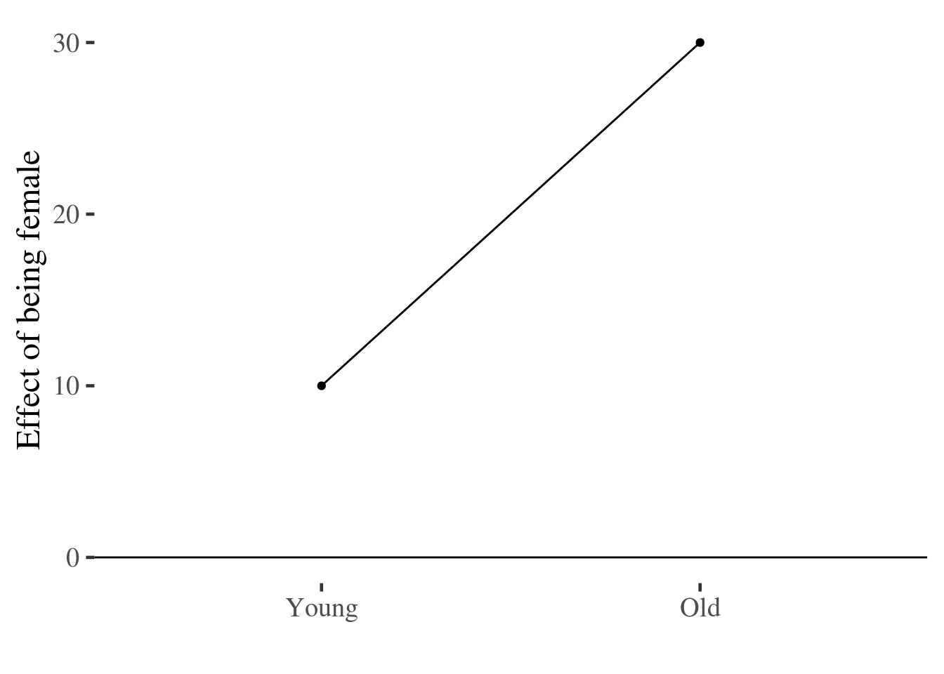
As before, these differences use the raw data, but could have been calculated
from a statistical model. In the section below we do this, making predictions
for means and marginal effects from a lm().
Continuous predictors
In the examples above, our data were all categorical, which mean that it was straightforward to identify categories of people for whom we might want to make a prediction (i.e. young men, young women, older men, older women).
However, age is typically measured as a continuous variable, and we would want
to use a grouped scatter plot to see this:
injuries %>%
  ggplot(aes(age, severity.of.injury, group=gender, color=gender)) +
  geom_point(size=1) +
  scale_color_discrete(name="")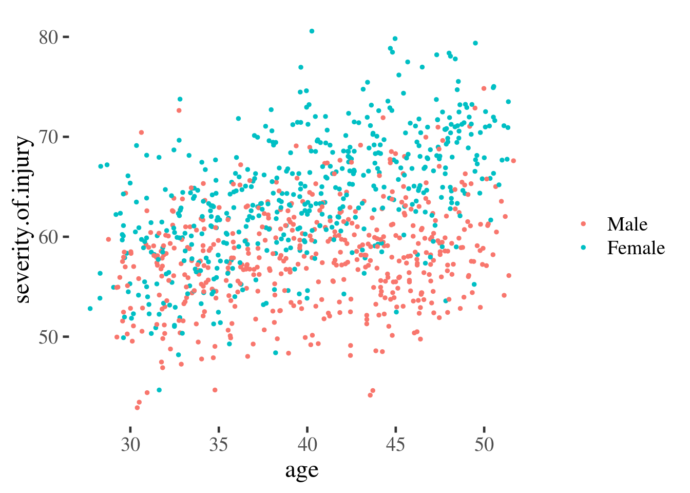
But to make predictions from this continuous data we need to fit a line through
the points (i.e. run a model). We can do this graphically by calling
geom_smooth() which attempts to fit a smooth line through the data we observe:
injuries %>%
  ggplot(aes(age, severity.of.injury, group=gender, color=gender)) +
  geom_point(alpha=.2, size=1) +
  geom_smooth(se=F)+
  scale_color_discrete(name="")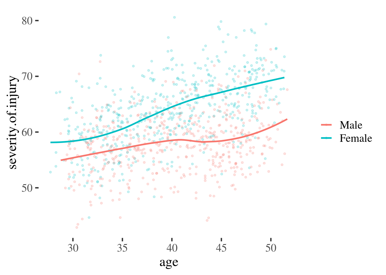
Figure 16.1: Scatter plot overlaid with smooth best-fit lines
And if we are confident that the relationships between predictor and outcome are sufficiently linear, then we can ask ggplot to fit a straight line using linear regression:
injuries %>%
  ggplot(aes(age, severity.of.injury, group=gender, color=gender)) +
  geom_point(alpha = .1, size = 1) +
  geom_smooth(se = F, linetype="dashed") +
  geom_smooth(method = "lm", se = F) +
  scale_color_discrete(name="")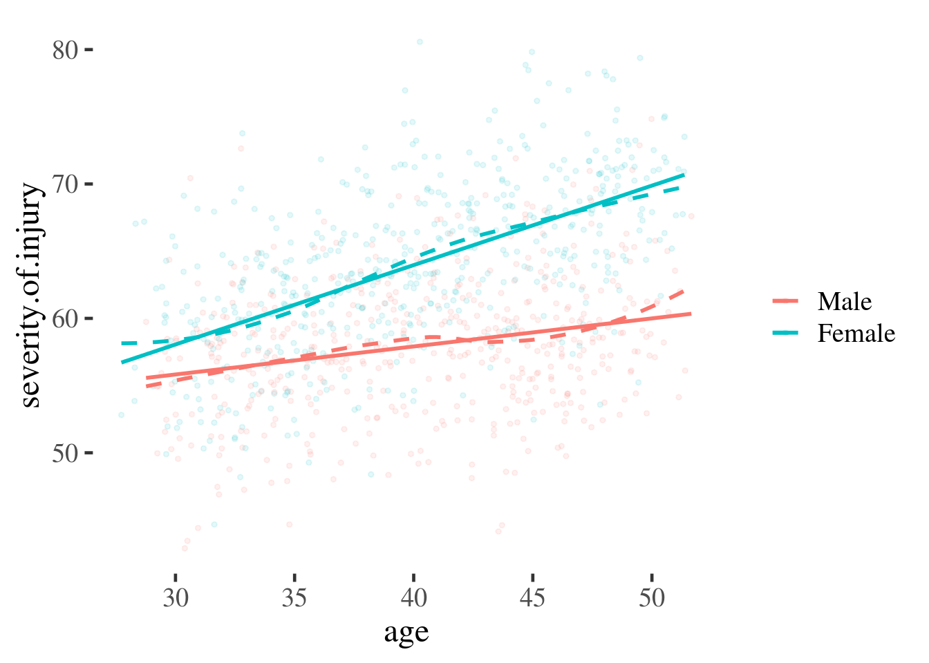
Figure 16.2: Scatter plot overlaid with smoothed lines (dotted) and linear predictions (coloured)
What these plots illustrate is the steps a researcher might take before fitting a regression model. The straight lines in the final plot represent our best guess for a person of a given age and gender, assuming a linear regression.
We can read from these lines to make a point prediction for men and women of a specific age, and use the information about our uncertainty in the prediction, captured by the model, to estimate the likely error.
To make our findings simpler to communicate, we might want to make estimates at specific ages and plot these. These ages could be:
- Values with biological or cultural meaning: for example 18 (new driver) v.s. 65 (retirement age)
- Statistical convention (e.g. median, 25th, and 75th centile, or mean +/- 1 SD)
We’ll see examples of both below.